Garman: A Timeless Display Font for Digital Branding
There it was—my client’s new coaching website hero section, live in Figma, with the headline “Clarity Starts Here” set in a safe-but-sleepy sans serif. I’d been testing fonts all morning, but nothing landed quite right. Then I dropped in Garman. Instantly, the space breathed differently. Not louder—but *clearer*. More intentional. Like the design had finally remembered its voice.
What Garman Brings to the Screen
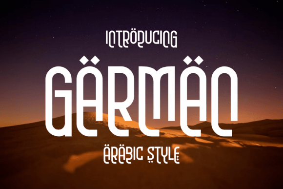
Garman is a classic display font—elegant without being fussy, structured without feeling rigid. Its letterforms carry quiet confidence: subtle contrast in stroke weight, balanced proportions, and just enough personality in the terminals and curves to feel human—not algorithmic. It’s not a script or a slab; it sits comfortably in that refined middle ground where editorial gravitas meets modern digital warmth. Think of it as the kind of typeface you’d trust to introduce a brand story on a landing page—or anchor a product launch banner that needs to resonate before the user scrolls.
How It Performs in Real Web Layouts
I tested Garman across three key contexts: a boutique online store homepage, a course sales page with layered visual hierarchy, and a portfolio site’s project showcase grid. In each case, it shined most powerfully at scale—not as body copy (more on that soon), but as the first point of contact: headlines, section titles, CTA buttons, and logo lockups.
On the coaching site, Garman in 48px (desktop) over a soft gradient background created immediate focus—no extra animation needed. On mobile, I scaled it to 32px with generous letter-spacing and kept line height at 1.3. It remained legible, even on lower-DPI Android screens. Over imagery? Yes—but only when the background had enough contrast or blur. I avoided placing it directly over busy textures or low-contrast photos without a subtle drop shadow or semi-transparent overlay.
Where Garman Elevates—and Where It Steps Back
Garman thrives in moments that ask users to pause and absorb: a welcome message, a value proposition, a testimonial quote pulled out as a highlight, or a seasonal campaign banner (“Summer Sessions Open”). It adds perceived quality instantly—especially in niches like wellness, creative services, education, and small-batch retail, where tone and trust are part of the product.
But here’s what I learned from testing: Garman isn’t built for long-form reading. I tried it for blog post headings (yes) and subheads (still great)—but swapped it out fast for body text. At smaller sizes (<18px), especially in UI elements like form labels, navigation links, or footer menus, its character details begin to soften. For accessibility and scannability, I always paired it with a clean, highly legible sans serif—like Inter, Poppins, or a well-hinted version of Helvetica Neue—for all supporting text.
It also doesn’t work well in dense dashboard interfaces or data-heavy admin panels. There, clarity trumps charm. Save Garman for the front-facing, brand-forward layers—the parts of your site that invite connection, not calculation.
Smart Pairings and Practical Implementation
Font pairing isn’t decorative—it’s functional. With Garman, I consistently reached for a neutral, versatile sans serif with open apertures and friendly x-height. That combo creates rhythm: Garman sets the mood; the sans carries the message. For a more editorial feel—say, on a writer’s portfolio—I paired it with a gentle serif like Lora or Merriweather for body text, letting Garman handle only the largest typographic moments.
Before deploying, I checked the font files: Garman includes multiple weights (Light, Regular, Bold), true italics (not skewed), and OpenType features like ligatures and discretionary alternates—useful for customizing headlines without over-designing. Crucially, it’s available in WOFF2 format, so loading performance stays light. I confirmed commercial licensing covers web use—including SaaS dashboards and client sites—so no surprises down the road.
For responsive behavior, I used clamp() for headline sizing: clamp(24px, 4vw + 12px, 48px). This keeps Garman expressive on large screens but gracefully restrained on mobile—never cramped, never overwhelming.
Small Details That Make a Difference Online
Readability isn’t just about size. I paid attention to color contrast (always tested against WCAG AA minimums), line length (kept hero headlines to under 60 characters for quick scanning), and spacing. Garman benefits from slightly more letter-spacing than average—especially at larger sizes—to prevent visual crowding. And because it’s a display font, I avoided ALL-CAPS usage unless intentionally stylized; lowercase or title case preserved its natural flow.
I also tested how it rendered in dark mode. With a subtle weight adjustment (swapping Regular for Bold in dark themes), and a warm off-white instead of pure white, Garman retained its sophistication—no harsh glare, no loss of definition.
If you’re designing for conversion—a product landing page, course checkout flow, or service inquiry form—Garman works best when it introduces *intent*, not instruction. Use it for the headline above the fold, the benefit-driven subhead, and the primary CTA button label. Let the supporting copy do the explaining.
Garman won’t fix weak messaging—but it will make strong messaging unforgettable. It’s the kind of display font that feels like a quiet collaboration between designer and audience: respectful of their time, confident in its role, and deeply intentional in every curve.